Showing posts with label Art Work. Show all posts

Monday, 20 June 2011

New Forum Signature

 (Click image for larger view, transparent background)

This is some personal work for BFP4F forums, set as my current forum signature. I made this on PhotoShop. The text in the background was made into a gradient with reduced opacity. The weapons were placed pointing in 4 directions, aided by the rule tool. Given a colour overlay and brush around the edges using the blur tool, to smooth out the pixelated edges. The names were added next to each weapon, with a gradient stroke and slightly reduced opacity. The skull vector was added in the middle, and brushed over to reduce detail and create a flat image. The lightning effects are custom brushes, and have been given a gradient effect.

 PhotoShop CS3 ~4 Hours

Monday, 13 June 2011

Holiday Poster

This is the main final design which I produced during my Final Major Project. The subject was to produce an A3 holiday poster advertising Turkey (I mainly focused on Istanbul). I originally made this using PhotoShop but it caused a few problems such as pixelating when being resized or altered in anyway. So it has been remade using Illustrator, since I wanted it to be a clean vector image which could be transformed and resized without any problems. I created a calm looking sunset/evening feel. Using soft purples and a strong orange. The orange helps bring out the black silhouette. I had plans to add some more features, such as the Bosphorus Bridge but it would look too busy in the background. I am pleased with the more clean looking vector version and will perhaps change/add some features in the future to try and improve it, as it is looking a bit too plain at the moment.

Typographic Posters

These are my final designs for the Typography Project, where I had to design a poster promoting a selected book from a list, primarily using type. I chose the book 'New Vintage Type - Classical Fonts for the Digital Age'. Looking through the book I spotted the old Russian fonts, and instantly decided to create a constructivist style poster. 

 For this piece I focused entirely on the font. Trying to connect all the letters together in some way. And to be honest the set up of the letters did not go as originally planned. However, I think that it turned out okay. The sunburst behind gave it a good effect.

 My type poster based on the Soviet Star. Created in Illustrator, I vectored up the star, and added in the type in between the spaces. Using the direct select tool I distorted the letters to fit them in within the gaps more appropriately. The background is covered with the names of the authors, reflected and copy/pasted continuously, and reduced opacity. This is my favourite design out of the 3 finals I produced, since it went to plan and turned out exactly the way I wanted it.

  My third and final design, I tried to add a more sunburst feel to my poster. Instead of using imagery, I created the burst using text. I don't think it makes such a big impact on the image as whole though. I added the typical Russian star in the bottom corner with the subtitle of the book. I think the colours work great and gives a powerful effect, however the type of imagery I tried to create with the text didnt work as well.


Narrative Outcomes


These are a few examples of my outcomes for the Narrative project, producing 3 slides including text from a chosen source e.g.songs or novels. This is showing one of my slides showing different variations. This was made using PhotoShop CS3 + WACOM Bamboo Graphics Tablet. 

My personal favourite is the red version as it makes more of an impact, and the white text is brought out from the red. However the original has to be blue since it fits the text. To create the 'chilling' effect I simply created a layer over the entire image (in a light blue) and just reduced the opacity to desaturate the colour.

 This particular piece took approx. 6 hours to produce.

Monday, 14 February 2011

MTP for Narrative Project


In the art studio we created a few/several sheets of random MTP using materials, paints, inks, and other forms of media like collage to create the textured effect. I have stuck to using acrylics and black ink. The acrylic helps to form the texture look, creating a rough surface with vein like shapes forming where the brush had been taken off the page.  The ink created the smooth and flat colours. Which is good for overlapping the textures without effecting them.

 I have cut out a few sections that I liked out of my MTP. They turned out quite well from some totally random paint splatters and mixed colours.

Sunday, 9 January 2011

Photoshop signatures

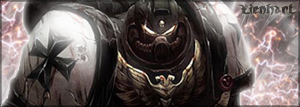
These are some amatuer photoshop signatures I made for forum use by myself and others: