Monday, 13 June 2011

Inspiring Artists

Ertac Altinoz

 Ertac is a fantasy artist from Turkey, who designs most of his work for gaming companies and magazines. He creates alot of personal art along with his work as well. His work is very detailed though with a bit of cartoony/fantasy elements. He gains his insipiration from his surrounding environment, and living in the country alot of his work has some natural elements.

  Hanging Gardens of Babylon - A personal favourite, where his inspiration from the country and nature really show. I like how he has re-imagined the ancient city of Babylon. 


 Agent In Action  - Sci Fi action piece where you can really see the cartoony side of Ertac's work. With slightly over the top proportions.


 Flint - One of his many fantasy artworks, possibly inspired by his interests in J.R.R. Tolkien's Lord of the Rings. I like the detail in the amor and the axe, and the fiery background brings out his angry expression.


Mirza - Gathers elements from old Turkic Warriors (pre-Ottoman). Some artwork for a current game.


Slam - A clash of fantasy, with little idea of what is really happening. The colours are all different and don't got together at all, which brings out each individual character in the scene. 


Yek-Han - Showing a 'Khan like' figure in a battlefield of bodies, the body language shows dominance among the rest. I think that the fiery setting below reveals bad intent. This is a piece of artwork for an end game piece for "Erlikhan".


Narrative Outcomes


These are a few examples of my outcomes for the Narrative project, producing 3 slides including text from a chosen source e.g.songs or novels. This is showing one of my slides showing different variations. This was made using PhotoShop CS3 + WACOM Bamboo Graphics Tablet. 

My personal favourite is the red version as it makes more of an impact, and the white text is brought out from the red. However the original has to be blue since it fits the text. To create the 'chilling' effect I simply created a layer over the entire image (in a light blue) and just reduced the opacity to desaturate the colour.

 This particular piece took approx. 6 hours to produce.

Monday, 14 February 2011

MTP for Narrative Project


In the art studio we created a few/several sheets of random MTP using materials, paints, inks, and other forms of media like collage to create the textured effect. I have stuck to using acrylics and black ink. The acrylic helps to form the texture look, creating a rough surface with vein like shapes forming where the brush had been taken off the page.  The ink created the smooth and flat colours. Which is good for overlapping the textures without effecting them.

 I have cut out a few sections that I liked out of my MTP. They turned out quite well from some totally random paint splatters and mixed colours.

Monday, 10 January 2011

Web Home Page

This is my design for my Illustration homepage. I've used dark colours and tried to give it a metallic/industrial theme.  I've added in one of my own recent illustrations into the home page.

It has a simple menu layout across the top, and the menus on the right side will be a flash based menu. New and updates will be displayed on the bottom of the page.

Sunday, 9 January 2011

Photoshop signatures

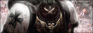
These are some amatuer photoshop signatures I made for forum use by myself and others:


Illustration Courses

I have been looking at some courses lately and ones which have caught my eye, and offer illustration courses are:


• University of Hertfordshire.
http://www.herts.ac.uk/home-page.cfm


• Illustration BA (Hons)
University For The Creative Arts

Department of Maidstone


• HND Graphic Design (Part of University of Greenwich) at Canterbury College.


Sunday, 28 November 2010

Photography

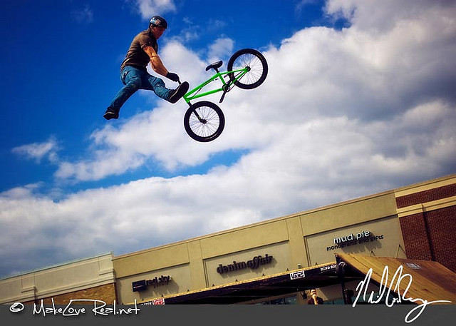
Here are many examples I gathered which use different effects and settings to create top quality and some abstract images.


A sunset, where the photographer has captured the rays effectively. Most of the focus is on the right side of the image .

The lighting in the background creates the shadows in the foreground as it is only a single light source which makes the camera view it as a dark contrast .

 The lights are blurred out, possibly by the fog in the background or the camera is focused more towards the right of the image.
The photographer has managed to use the camera in order to create the smudged line effects from the head and tail lights of passing vehicles. Standing on a bridge, overlooking both roads. Though the lights in the background do not seem to be effected.
The street lights give an impact to all the objects below them, creating a contrast between the ground and the sky.
This photographer has managed to capture the majority of LA during sunset. The colour of  the lights matches well with the sky. If this was taken during night it wouldn't have such a great effect and ruin the whole contrast. It reminds me of quite a hellish scene at first glance.


The light source coming in from above creates an orange dusky effect within the caverns, and brings out the detail within the rock walls.
The photographer has managed to focus into a single building blurring out the background. It makes you feel as if you have been launched into the image.
A Subaru Impreza in the WRC. A sideshot of the car speeding round the corner. Most shots are taken from the side view as it gives more of an impact to the image. The motion blur effect creates the most impact as it brings out the rally car.