For my FMP I decided to produce an A3 holiday poster and an A5 brochure to advertise tourism in Turkey. I first researched into Turkey, the culture, traditions, cuisine, holiday locations and resorts. This helped me gather good info of what I should include in my poster and booklet. My poster was based mainly on advertising Istanbul, such as the landmarks - Sultan Ahmet, Bosphorus Bridge, Maidens Tower, Galata Tower etc. After some work I decided to include the Sultan Ahmet in the background as a silhouetted building in the background. I added some calm purples and oranges in the background to produce a relaxing evening scene, with a dinner table overlooking the city from a balcony, creating a sort of romantic feel to the image. So I guess this appeals more to couples than family & friends. It was fun to make, even though it was quite a simple vector image, but I like the relaxing feel the imagery and colours give off.
Creating the booklet was quite a challenge, as working on InDesign isn't my strongest point nor is creating any text based designs which involve layouts. (e.g. Magazine project) It involved photographs of everything including resorts, landmarks, history, cuisine, maps, and anything else related to those categories. The text I wrote my self while taking reference from online sources about somethings I wasn't sure about. Some pages did not have enough written on them, or wasn't able to fit in the text due to too much info so I had to work out ways in which I could fill up the pages appropriately so there would not be large gaps between the text and imagery. Personally I didn't find making the booklet too enjoyable since I didn't really like the layout of it, but the imagery I think, was the best outcome from this. I tried to focus entirely on calm, light blue colours throughout the booklet, e.g. titles, headers, sub headers etc. And I tried to find alot of imagery including beaches and seaside resorts which would fit the theme of the booklet very well.
This project wasn't really to my taste as advertising isn't really my strong point. It was quite difficult to come up with some ideas since the imagery I could use were quite limited, I mainly had to get imagery on anything based on Turkey and holiday resorts and locations. So I couldn't really create my own designs but stick with what already exists. If I were to do this project again, I would most likely ditch the booklet idea and possibly create another poster or two, which would have been alot more creative for me. Another choice would have been to pick a completely different subject, such as comic book illustration. Same as my Narrative Image making project, where I focused on the Crime Noir scene. This would have been alot more enjoyable and I wouldn't have to be too limited about creativity and designs.

Wednesday, 29 June 2011

Monday, 20 June 2011
Courses After ND Graphics
My applied courses were BA Illustration at Maidstone UCA, Uni of Hertfordshire Uni of Westminister. I have been accepted into HND Graphic Design (Level 5), which was my top choice, since it was closer to where I live, better financially (e.g. short travel, no need to pay for accommodation). Also the course offers me a mix of both Graphic Design and Illustration, giving me the choice to combine the two styles I mainly work with. I turned down Maidstone since it did not really offer me much compared to the other courses. Also Westminister I turned down since they didn't recommend me for the Illustration. And finally no reply from Uni of Hertfordshire, though what the course offered me was the perfect mix of Graphic Design and Illustration. From my new course I am expecting to combine my Graphic work with my style of illustration, and hope to gain from my years there the experience acquired to go out and find work, and build up my art portfolio over the years.
New Forum Signature

(Click image for larger view, transparent background)
This is some personal work for BFP4F forums, set as my current forum signature. I made this on PhotoShop. The text in the background was made into a gradient with reduced opacity. The weapons were placed pointing in 4 directions, aided by the rule tool. Given a colour overlay and brush around the edges using the blur tool, to smooth out the pixelated edges. The names were added next to each weapon, with a gradient stroke and slightly reduced opacity. The skull vector was added in the middle, and brushed over to reduce detail and create a flat image. The lightning effects are custom brushes, and have been given a gradient effect.
PhotoShop CS3 ~4 Hours
Tuesday, 14 June 2011
Inspiring Artists
Emrah Elmasli
Emrah is a Turkish concept artist from Izmir, who currently specializes in designing artwork and characters for video games. His clients include Wizards of the Coast, Lionhead Studios (more recently, designed concepts for Fable 3) and Eidos, to name a few famous game developers. During Uni, he discovered his talents with digital painting and illustration. Moving to Istanbul, he began designing concepts and storyboards, but with the gaming industry being small in Turkey, he moved to the UK. There he began working for some big clients, most notably for Lionhead Studios. He is currently employed as a full time concept artist for a video game company, and works freelance as well for other clients. His inspirations are similar to mine, coming from old Ottoman culture, sci fi and movies. Which makes Emrah Elmasli a good artist to refer to when looking for inspiration in my artwork.


 A concept for Fable 3. These are 'dwellers' a group of gypsy/nomad type people. You can see here the resemblance he gives to the more Asian nomadic tribes.
 More dwellers, really showing their gypsy like culture with the style of clothes.
 More sci fi related artwork. You can tell how he connects his inspiration between old and new by looking at the patterns around the figure.
Emrah is a Turkish concept artist from Izmir, who currently specializes in designing artwork and characters for video games. His clients include Wizards of the Coast, Lionhead Studios (more recently, designed concepts for Fable 3) and Eidos, to name a few famous game developers. During Uni, he discovered his talents with digital painting and illustration. Moving to Istanbul, he began designing concepts and storyboards, but with the gaming industry being small in Turkey, he moved to the UK. There he began working for some big clients, most notably for Lionhead Studios. He is currently employed as a full time concept artist for a video game company, and works freelance as well for other clients. His inspirations are similar to mine, coming from old Ottoman culture, sci fi and movies. Which makes Emrah Elmasli a good artist to refer to when looking for inspiration in my artwork.


Monday, 13 June 2011
Holiday Poster


Typographic Posters
These are my final designs for the Typography Project, where I had to design a poster promoting a selected book from a list, primarily using type. I chose the book 'New Vintage Type - Classical Fonts for the Digital Age'. Looking through the book I spotted the old Russian fonts, and instantly decided to create a constructivist style poster.
 For this piece I focused entirely on the font. Trying to connect all the letters together in some way. And to be honest the set up of the letters did not go as originally planned. However, I think that it turned out okay. The sunburst behind gave it a good effect.

My type poster based on the Soviet Star. Created in Illustrator, I vectored up the star, and added in the type in between the spaces. Using the direct select tool I distorted the letters to fit them in within the gaps more appropriately. The background is covered with the names of the authors, reflected and copy/pasted continuously, and reduced opacity. This is my favourite design out of the 3 finals I produced, since it went to plan and turned out exactly the way I wanted it.
 My third and final design, I tried to add a more sunburst feel to my poster. Instead of using imagery, I created the burst using text. I don't think it makes such a big impact on the image as whole though. I added the typical Russian star in the bottom corner with the subtitle of the book. I think the colours work great and gives a powerful effect, however the type of imagery I tried to create with the text didnt work as well.


My type poster based on the Soviet Star. Created in Illustrator, I vectored up the star, and added in the type in between the spaces. Using the direct select tool I distorted the letters to fit them in within the gaps more appropriately. The background is covered with the names of the authors, reflected and copy/pasted continuously, and reduced opacity. This is my favourite design out of the 3 finals I produced, since it went to plan and turned out exactly the way I wanted it.


Inspiring Artists
Ertac Altinoz
Ertac is a fantasy artist from Turkey, who designs most of his work for gaming companies and magazines. He creates alot of personal art along with his work as well. His work is very detailed though with a bit of cartoony/fantasy elements. He gains his insipiration from his surrounding environment, and living in the country alot of his work has some natural elements.
 Hanging Gardens of Babylon - A personal favourite, where his inspiration from the country and nature really show. I like how he has re-imagined the ancient city of Babylon.
 Agent In Action - Sci Fi action piece where you can really see the cartoony side of Ertac's work. With slightly over the top proportions.
 Flint - One of his many fantasy artworks, possibly inspired by his interests in J.R.R. Tolkien's Lord of the Rings. I like the detail in the amor and the axe, and the fiery background brings out his angry expression.
 Mirza - Gathers elements from old Turkic Warriors (pre-Ottoman). Some artwork for a current game.
 Slam - A clash of fantasy, with little idea of what is really happening. The colours are all different and don't got together at all, which brings out each individual character in the scene.
 Yek-Han - Showing a 'Khan like' figure in a battlefield of bodies, the body language shows dominance among the rest. I think that the fiery setting below reveals bad intent. This is a piece of artwork for an end game piece for "Erlikhan".
Ertac is a fantasy artist from Turkey, who designs most of his work for gaming companies and magazines. He creates alot of personal art along with his work as well. His work is very detailed though with a bit of cartoony/fantasy elements. He gains his insipiration from his surrounding environment, and living in the country alot of his work has some natural elements.


Narrative Outcomes


These are a few examples of my outcomes for the Narrative project, producing 3 slides including text from a chosen source e.g.songs or novels. This is showing one of my slides showing different variations. This was made using PhotoShop CS3 + WACOM Bamboo Graphics Tablet.
My personal favourite is the red version as it makes more of an impact, and the white text is brought out from the red. However the original has to be blue since it fits the text. To create the 'chilling' effect I simply created a layer over the entire image (in a light blue) and just reduced the opacity to desaturate the colour.
This particular piece took approx. 6 hours to produce.
Monday, 14 February 2011
MTP for Narrative Project


In the art studio we created a few/several sheets of random MTP using materials, paints, inks, and other forms of media like collage to create the textured effect. I have stuck to using acrylics and black ink. The acrylic helps to form the texture look, creating a rough surface with vein like shapes forming where the brush had been taken off the page. The ink created the smooth and flat colours. Which is good for overlapping the textures without effecting them.
I have cut out a few sections that I liked out of my MTP. They turned out quite well from some totally random paint splatters and mixed colours.
Monday, 10 January 2011
Web Home Page

It has a simple menu layout across the top, and the menus on the right side will be a flash based menu. New and updates will be displayed on the bottom of the page.
Sunday, 9 January 2011
Photoshop signatures
These are some amatuer photoshop signatures I made for forum use by myself and others:


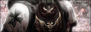


Illustration Courses
I have been looking at some courses lately and ones which have caught my eye, and offer illustration courses are:
• University of Hertfordshire.
http://www.herts.ac.uk/home-page.cfm
• Illustration BA (Hons)
• University of Hertfordshire.
http://www.herts.ac.uk/home-page.cfm
• Illustration BA (Hons)
University For The Creative Arts
Department of Maidstone
• HND Graphic Design (Part of University of Greenwich) at Canterbury College.
Sunday, 28 November 2010
Photography
Here are many examples I gathered which use different effects and settings to create top quality and some abstract images.

A sunset, where the photographer has captured the rays effectively. Most of the focus is on the right side of the image .
 The lighting in the background creates the shadows in the foreground as it is only a single light source which makes the camera view it as a dark contrast .
 The lights are blurred out, possibly by the fog in the background or the camera is focused more towards the right of the image.
 The photographer has managed to use the camera in order to create the smudged line effects from the head and tail lights of passing vehicles. Standing on a bridge, overlooking both roads. Though the lights in the background do not seem to be effected.
 The street lights give an impact to all the objects below them, creating a contrast between the ground and the sky.


A sunset, where the photographer has captured the rays effectively. Most of the focus is on the right side of the image .


This photographer has managed to capture the majority of LA during sunset. The colour of the lights matches well with the sky. If this was taken during night it wouldn't have such a great effect and ruin the whole contrast. It reminds me of quite a hellish scene at first glance.

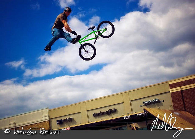

The light source coming in from above creates an orange dusky effect within the caverns, and brings out the detail within the rock walls.

The photographer has managed to focus into a single building blurring out the background. It makes you feel as if you have been launched into the image.

A Subaru Impreza in the WRC. A sideshot of the car speeding round the corner. Most shots are taken from the side view as it gives more of an impact to the image. The motion blur effect creates the most impact as it brings out the rally car.
Monday, 4 October 2010
Websites based on Illustration
http://www.illustrationweb.com/illustrators/all.asp
http://www.centralillustration.com/
http://www.arenaworks.com/index.php#
http://www.enroc.com/
http://www.deviantart.com/

An amazing self taught pencil artist, creating photo realistic images: http://lion83.deviantart.com/
http://www.centralillustration.com/
http://www.arenaworks.com/index.php#
http://www.enroc.com/
http://www.deviantart.com/
An amazing self taught pencil artist, creating photo realistic images: http://lion83.deviantart.com/
Monday, 27 September 2010
Starting out blog
Hi all, this is my new blog. I'm just starting out and will be updating this regularly over the course of the year with any artwork, photography, web design. Links to websites, artists, profiles, and anything related to design and the progression of my course will be posted in this blog.

I have begun to write my UCAS statement to upload to the main site as part of my progression onto higher education. The image above is a link to the main site. UCAS is the main site where students wanting to go onto H.E courses can find the universities or colleges they wish to apply for and find out more info about them.
Subscribe to:
Posts (Atom)